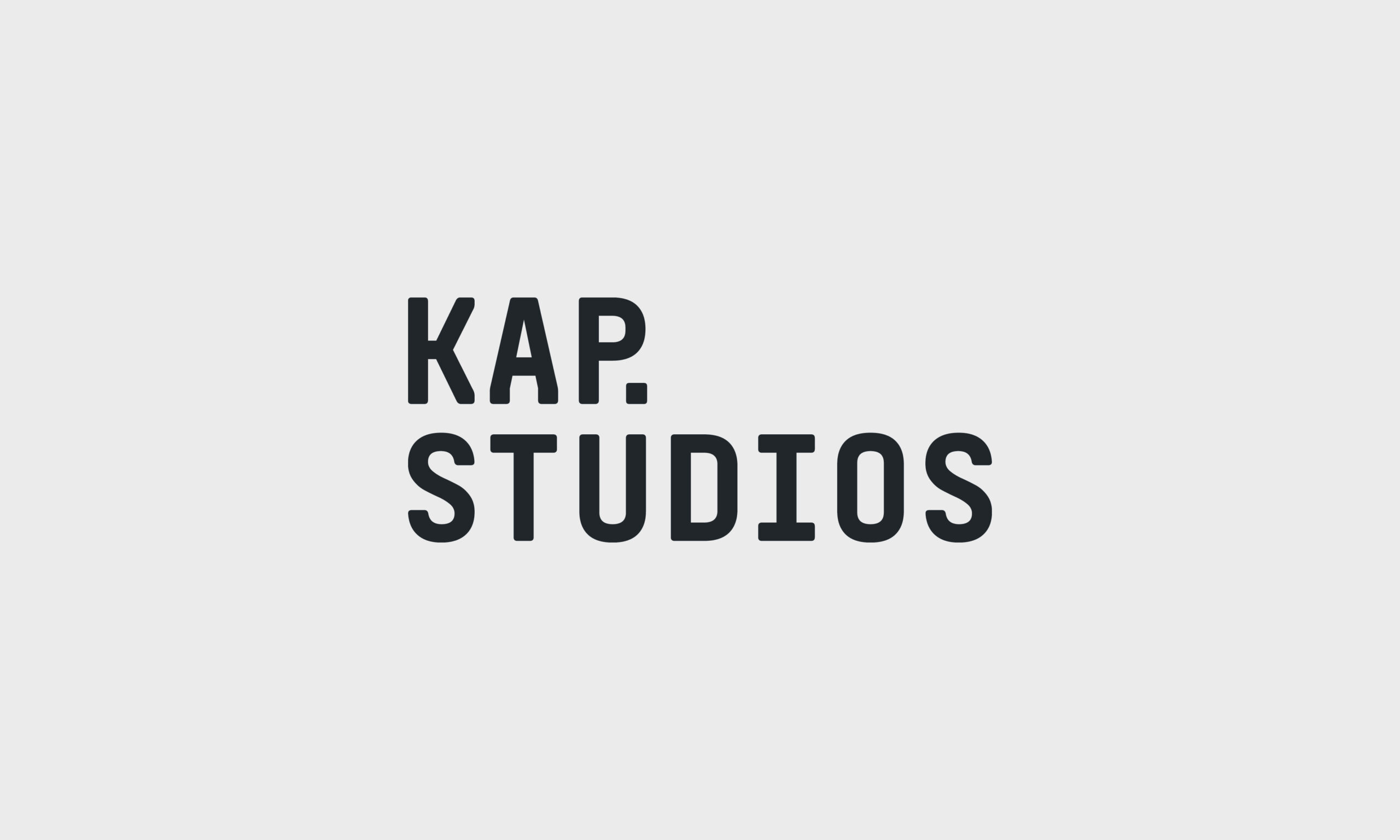
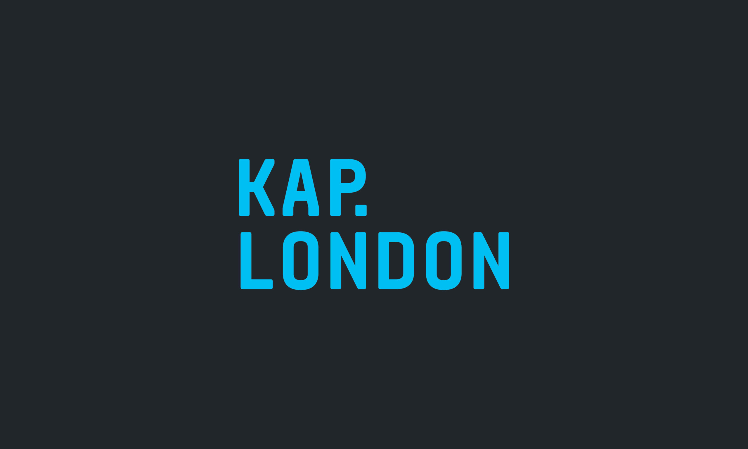
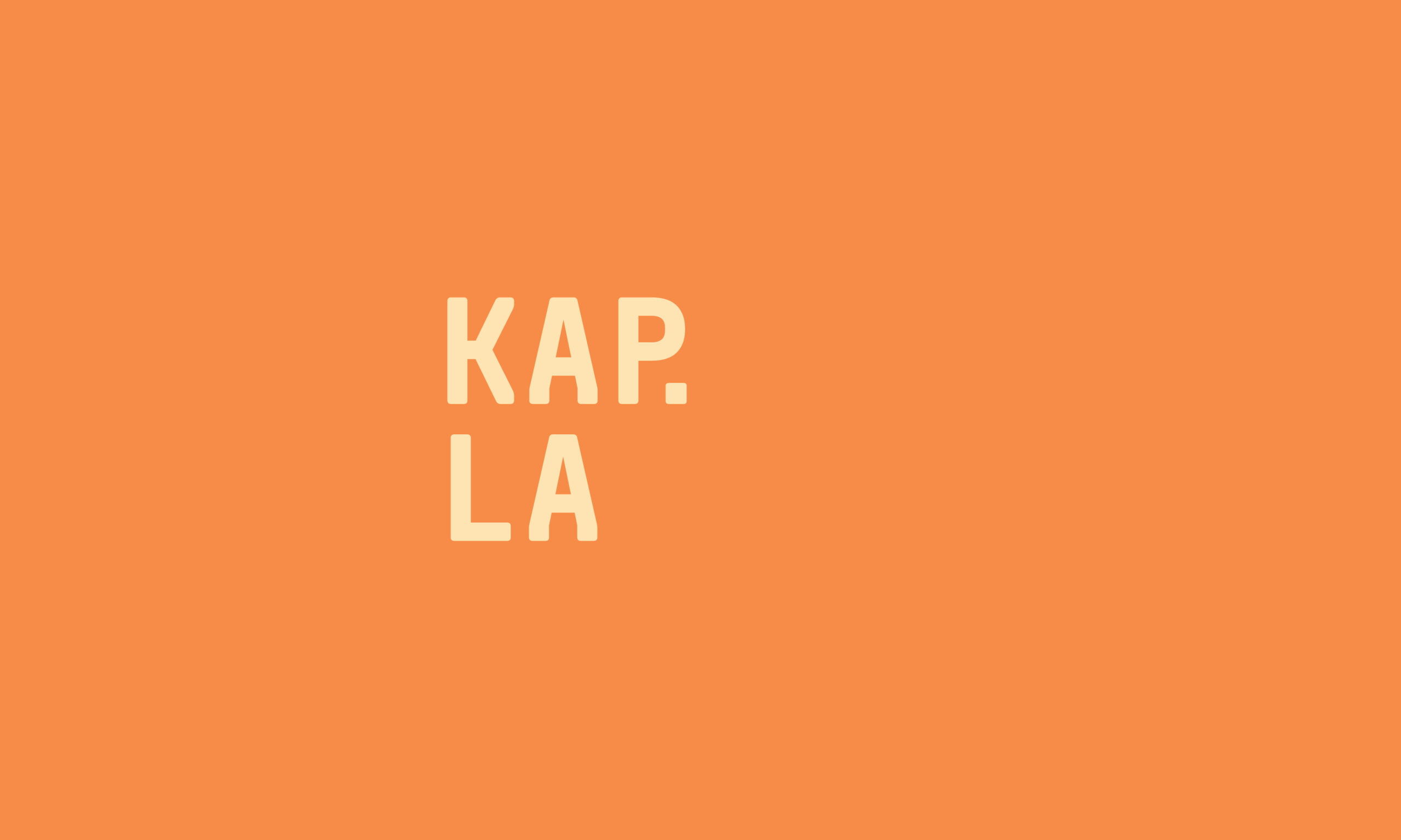
KAP Studios
- Branding
- Print Design
KAP Studios are a London and LA-based architectural practice. Working with clients from the earliest possible stage, they consult and advise on large-scale projects with their unique international perspective.
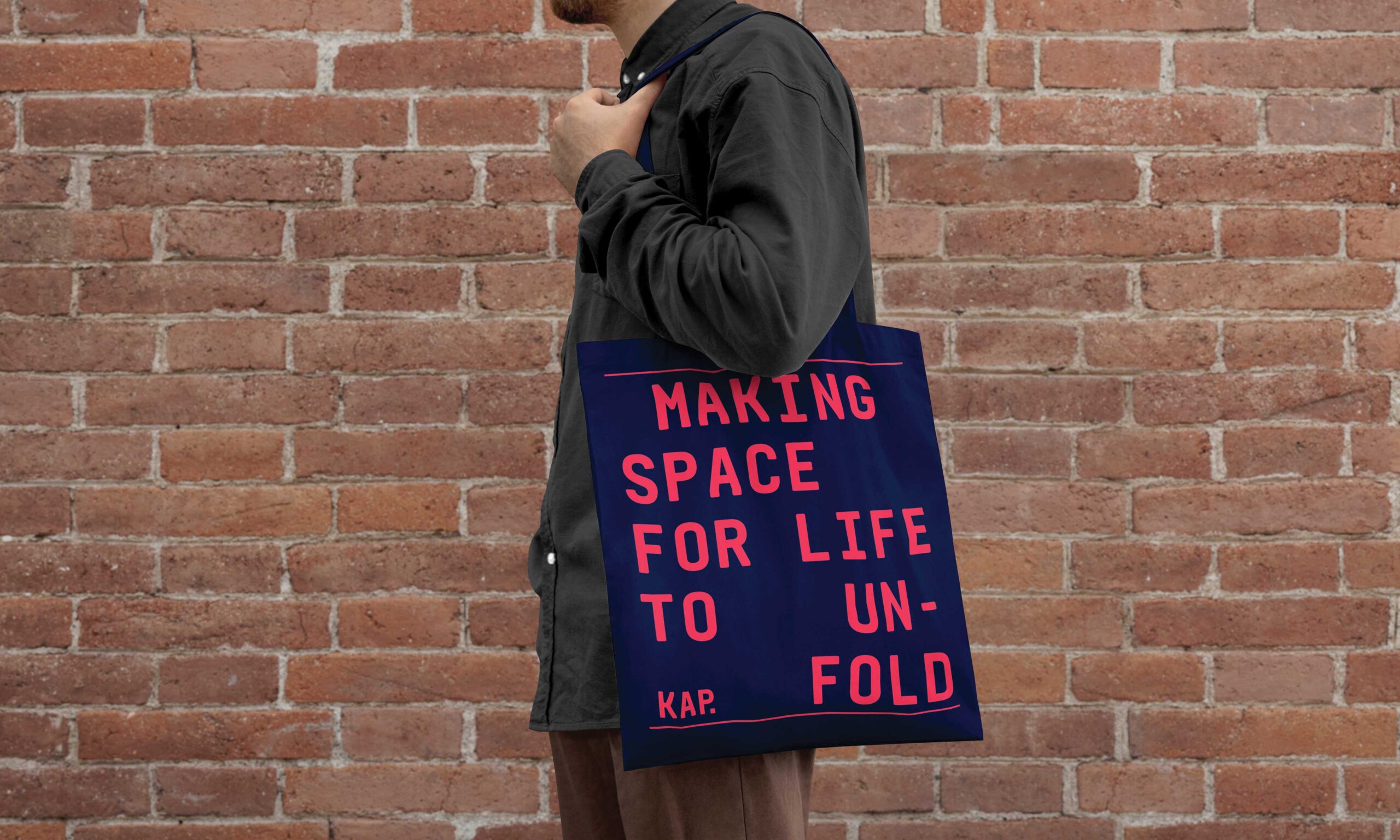
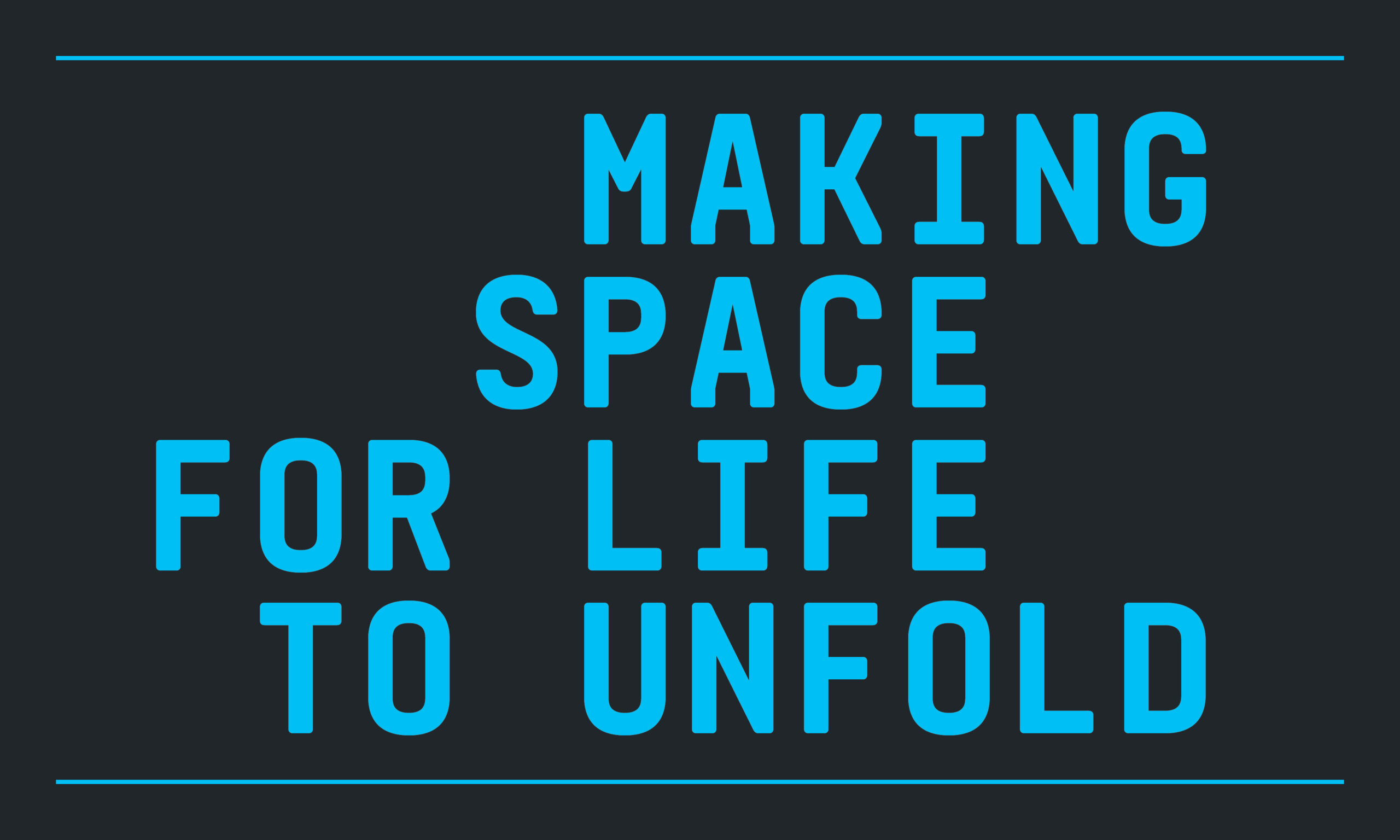
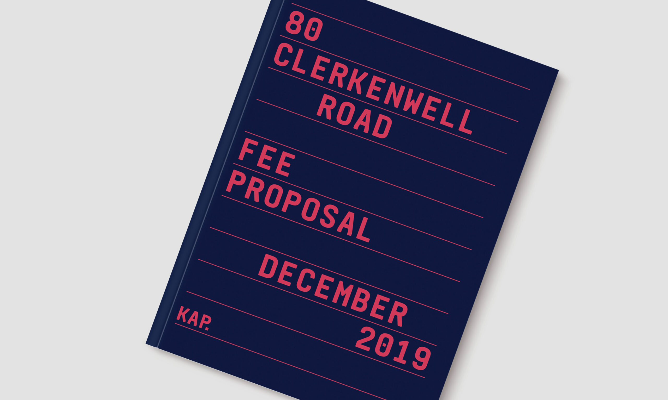
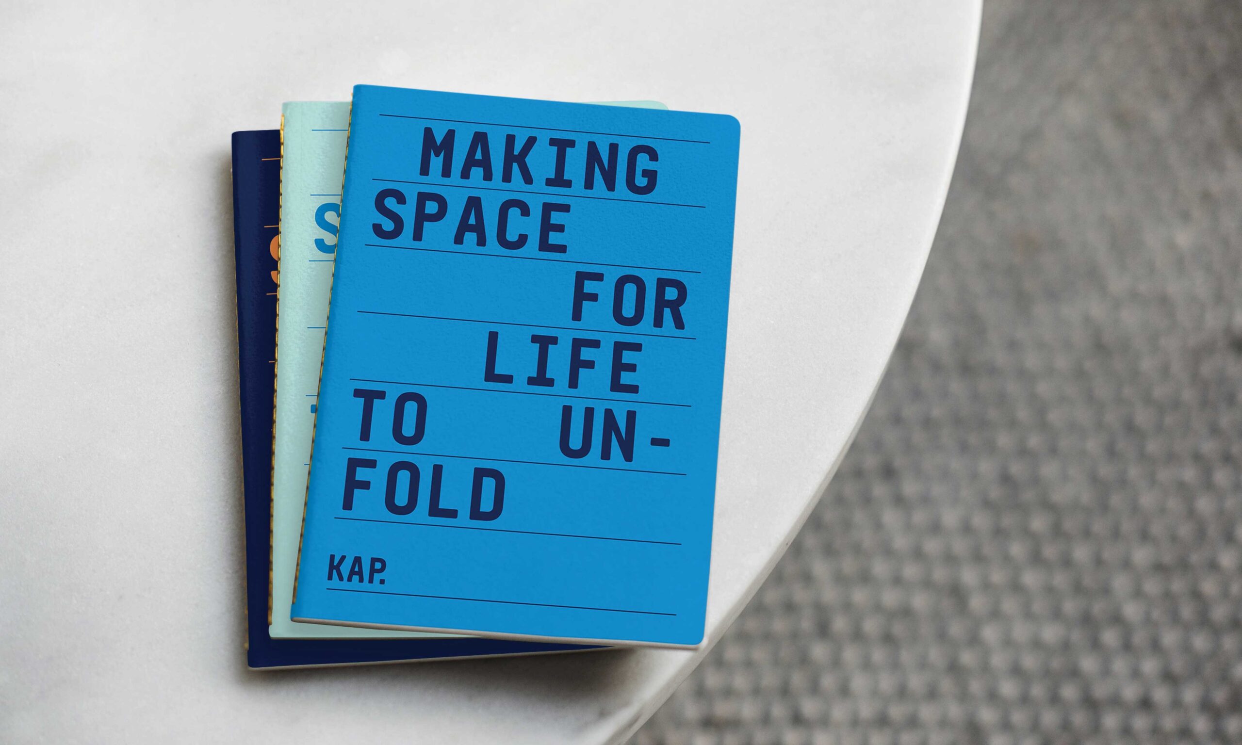
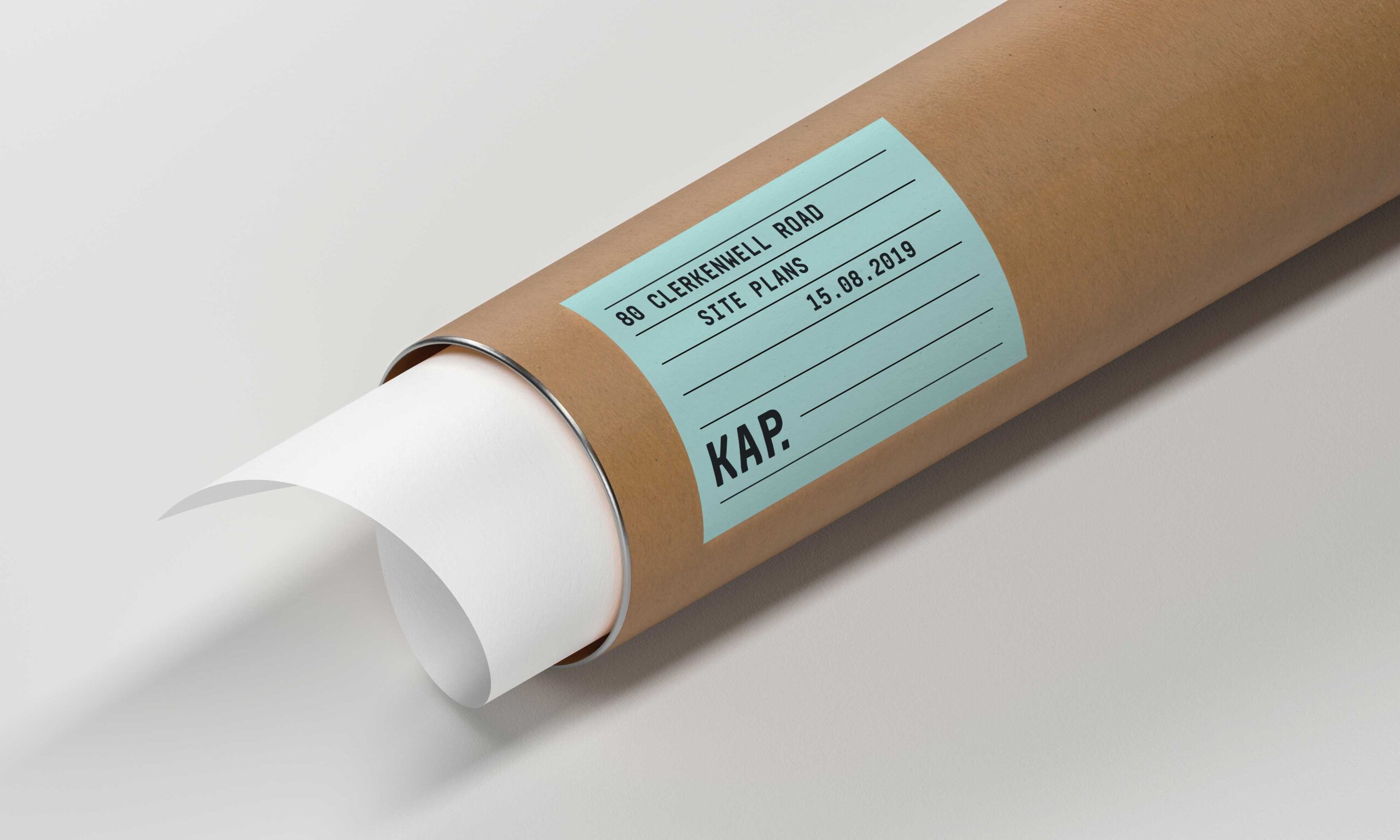
KAP isn’t a typical architecture practice, so they didn’t want to look like one. With a focus on their unique expertise and approach, we created a brand that felt bold and reliable. Built around a monospaced typographic system and a broad colour palette, we created a simple identity with a lot of flexibility. The typographic approach ensured their collateral was recognisably KAP, allowing them to be more playful with colour depending on the client and project.
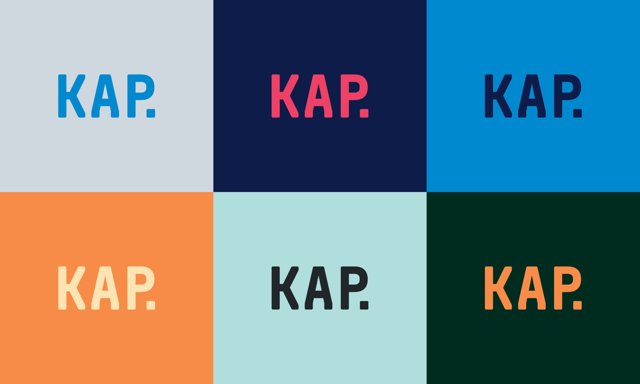
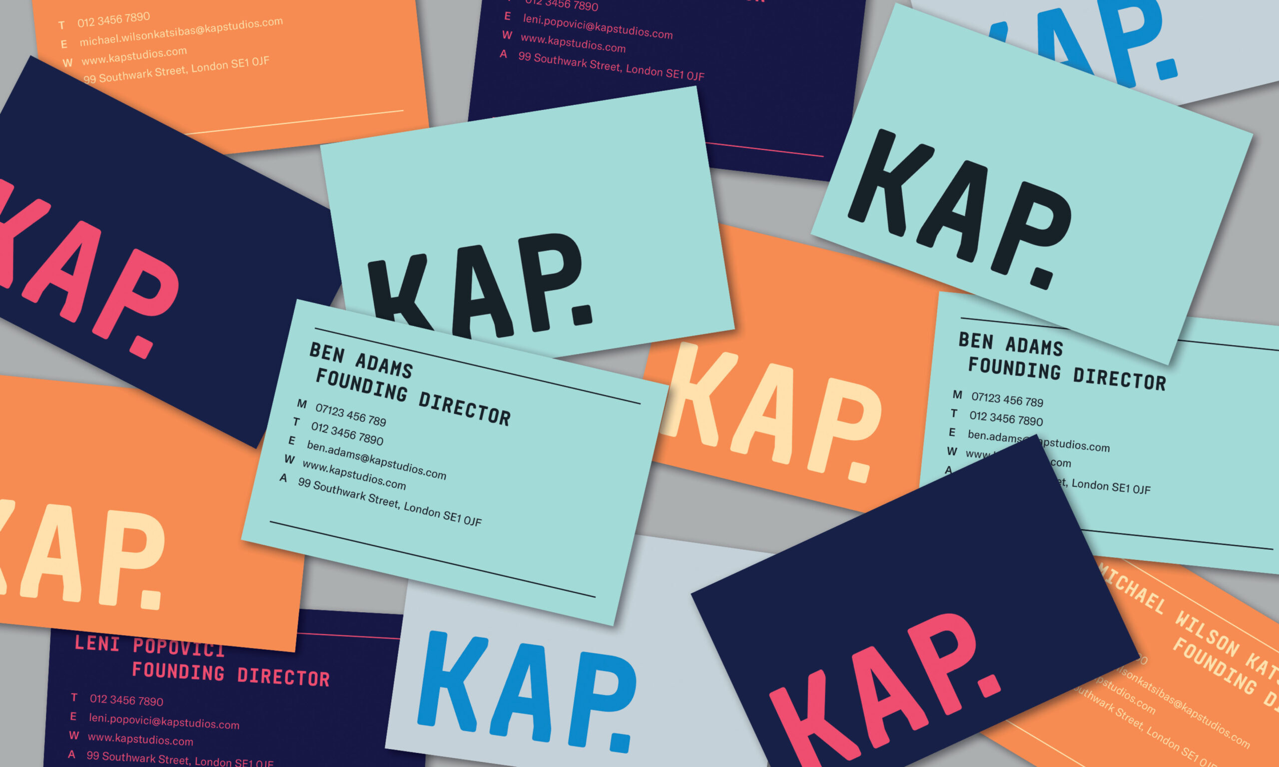
Working with Middle Name was a very insightful process — they understood the core of our business and helped us in creating a bold brand identity which was adaptable enough to speak to both London and LA audiences without losing a sense of cohesion. We love the inherent flexibility of our branding which allows us to tailor how we present ourselves to different clients in a way that really speaks to their business, all the while carrying through the KAP essence to all the material we produce.
Leni Popovici, Founding Director and Partner